This brief is to communicate and express certain words through a creative process, such as photography, vector image, painting etc.
We started by doing a group activity where we chose a word and did a brainstorm for it. Each group did one then we swapped with each group and added more and more to it.


I sketched out some ideas I had from the brainstorm.


My first idea was for isolation, and it involved someone on their own in woodland or in a field.
While the weather was good, I made a decision of getting a couple of people to come with me out to the Peak District, around Fox House because I knew a place which would be a good setting. We also went to some woodland near Ladybower reservoir, which was another place where I have been before.


The two images below are my favourite, I also liked the photo in the wood which is vertical, but it wasn’t really in focus, which was annoying. I wasn’t planning on using two images but I liked them both. I just have to run them through Photoshop just to change the levels to bring out the colour more.

I first changed the brightness and contrast just to bring out the definition in the trees and leaves.

I then changed the levels, which further defined the contrast of lights and darks and made the colours clearer.

I experimented with a faint radial gradient. It added mood to the image, but it wasn’t obvious to look like a border or something.

I also experimented by raising the saturation which made the colours more vibrant which improved the image I think.

I started editing this image. I had to erase Sabine’s face from the photo because the image was supposed to represent isolation, so it wouldn’t be very good with 2 people on it.

I used the clone stamp tool to select a part of the grass and bushes, which then covered up the part I wanted covering up.

I changed the levels like before to the same affect. I had to do it more than the other image though because it was more exposed to the sun, the image looked sort of bleached.

I put the same gradient overlay on it, I didn’t think it needed it as much as the other photo, but it makes it consistent with the other photo which I like.
My idea for the tea/coffee was inspired by the Twinings tea advert where this guy make a scene out of different tea at different strengths.


I started by making tea at different strengths, then lined them up on the kitchen floor ( because of the camera angle and space). I tried it with the wood background but with the texture and the tea, it made the image look too busy, so I tried on a blank background, using paper. This looked better, other than the shadows and the edges of the sheets, but they can easily be edited out in Photoshop.


The image below was my favourite. I really liked the shadows that the mugs casted. Other than the shadow at the top of the photo and the paper (which can just be Photoshopped out) it was a good outcome.

I opened up the image and selected the stamp tool to get rid of the lines where the paper sheets met.


To erase the shadows from the background, I went around the edge of the cups with the pen tool, made it a selection, inverted it and used the dodge tool to lighten the white. By doing this, it had no affect on the cups.

Now it looked better, but the cups ooked super imposed, and I wanted it to look more natural, and wanted to keep the cup shadows because i thought they looked good, so I darkened the shadows, but not too much though.
I also cropped the image because it felt like there was too much blank space blank space.
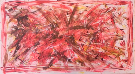
I thought I would have a go at a hand generated outcome instead of it all being photography. The idea I liked for rage was to just get a large surface, like a canvas, or sheet etc. then splatter paint and make rough brush strokes on the surface to show rage.
I started by researching painting similar to what I had in mind and also techniques on how I would create it.

Jackson Pollock


I looked at Jackson Pollock’s work, who was part of the Abstract Expressionism movement. He splattered and dripped paint onto canvases. I think his type of work represents rage, or anger because of the boldness and tone of his work. Also his technique is also quite an aggressive one, which comes through in his paintings.


I looked at tutorials on YouTube on how to splatter paint, and what techniques to use.
I had to think of what surface I could do it on. I wanted something big, rather than sticking to A4 or A3 paper. I was thinking of using a white sheet I had, but then I found an off cut of mount board which I thought word be perfect for it because it was big enough and thick, so the paint wouldn’t make it flimsy. It was a bit torn around one edge, but I just had to trim it with a scalpel.
Once I had the canvas, paints and other materials, I set up a work space outside because it was going to get a bit messy.
![DSCN1830[1]](https://jakepb7795.files.wordpress.com/2013/10/dscn18301.jpg)
I used a tray to mix the colours on. I tried to stick with loud, aggressive colours which would help communicate the word across. So I used reds, dark reds, blacks and browns. I referred to the colour connotations lecture we had to choose the colours. https://jakepb7795.wordpress.com/colour-connotations/.
I did also throw in some yellows and white to break it up a bit. The methods I used were roughly painting on the colours with a brush (I also used a palette knife to spread on bolder lines), which I also used to splatter and flick the paint, but I had to thin the paint down for it to work better. I also put paint on my fingers and flicked and spread it on which worked well. I used Jackson Pollock’s method from my research by dripping the paint over the canvas. I didn’t use the dripping method all the time because I think by roughly paint the harsh lines and spreading the paint made it look more explosive and aggressive.
Mike gave us a quick walkthrough on how to make a spiral optical illusion out of squares, and this inspired me to have a go at making my own illusion, seeing as one of the word choices was illusion I thought it tied in well.


I looked at different optical illusions on the internet and saw a few that I liked.
I also looked at an optical illusion book I found (more optical illusions (Al Seckel).


It didn’t have a lot of good examples of optical illusions, but it improved my understanding of illusions and how they work.

There was one optical illusion I saw which I thought looked good, it involved cubes and cuboids which overlapped each other so it played with your eyes. It looked easy enough to make, so I made a cube using a hexagon and shading in different parts of it.

I duplicated the cube twice, copying the image of the internet.

I duplicated the end cubes many times so it elongated, them. I duplicated the middle shade of grey section from the cube and put them at the bottom of the cuboids, this changed their perspective at the bottom.

The only bit of cutting out i had to do was to get the cube at the bottom to overlap the right cuboid.

I saw a tutorial for how to make a moving optical illusion and decided to give that a go.

I followed the step by step instructions.

I made a grid so I knew where to place the shapes I was going to make.

I chose a background colour. I chose red because it looked better than the colour on the tutorial, also the illusion seemed to work better in red. I tried blue because it looked like waves when it ‘moved’, but the illusion didn’t work in blue for some reason.

I made the shape using an oval, then made a gradient stroke on it. I duplicated the shape on each cross point on the grid, and rotated it 30 degrees each time.

Once I did one column, I just copied and pasted it again and again.

I kept the far left column at the same position, then moved the next one up one square each column.
FINAL OUTCOMES
